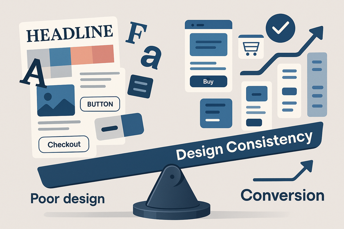
In an economy where milliseconds determine user retention and first impressions shape brand loyalty, design consistency is quietly becoming one of the most influential drivers of conversion. Across digital storefronts, landing pages, and social feeds, consistent visuals are doing more than just making brands look polished—they are engineering trust, reducing decision friction, and increasing revenue per visit.
This post explores how design consistency supports UX, shapes perception, and delivers measurable results in conversion optimization. From micro-interactions to large-scale campaigns, visual unity across touchpoints has become a silent but strategic advantage.
What Is Design Consistency and Why Does It Matter?
Design consistency refers to the visual and structural cohesion maintained across a brand’s digital and physical assets. This includes the use of consistent colors, typography, layouts, iconography, motion behavior, and tone in every brand interaction.
According to HubSpot’s latest design benchmarks, users form an impression of a website in just 50 milliseconds, and 94 percent of that impression is related to design. When every design element feels aligned, users subconsciously perceive the brand as more reliable and easier to engage with (HubSpot Blog).
In contrast, inconsistencies—such as mismatched colors, layout shifts, or branding variations between email and site—introduce cognitive friction. They create micro-breaks in user flow and trust, leading to bounce, cart abandonment, or hesitation.
Conversion-Focused UX Relies on Visual Unity
From a user experience (UX) perspective, design consistency acts as a guidepost. Familiar design elements reduce the mental effort required to navigate a page, complete a checkout, or engage with a feature. This predictability is especially valuable in mobile environments, where screen space is limited and attention is fragmented.
Brands with high-converting sites often standardize design through global component libraries or design systems. These systems—used by companies like Airbnb and Shopify—ensure that headers, buttons, modals, and product displays behave consistently across every page. This leads to fewer user errors, clearer CTAs, and faster paths to conversion.
A performance audit shared in the Shopify Blog showed that landing pages adhering to a consistent visual system saw a 28 percent higher click-through rate compared to those with varied layout structures. Consistency, in this case, was not just aesthetic—it was functional.
Case Study: Design Systems Driving Efficiency and Growth
Consider a boutique fashion brand preparing for a seasonal launch. Without a consistent design framework, its social media posts, email promotions, and website visuals each required separate creation workflows. This led to delays, mismatched messaging, and unclear brand positioning.
After implementing a modular design system, the team reduced creative production time by 40 percent. All content pulled from a shared style guide—ensuring the product launch page matched the story told in paid ads and the customer emails.
This approach mirrors Ukiyo Productions’ methodology of streamlining design within brand systems. Its product launch planner emphasizes visual cohesion as a growth lever, showing founders how to scale brand impact with fewer design resources.
Design Consistency Enhances Brand Recall
Consistent visuals also influence how memorable a brand is. Repeated exposure to the same color palette, font family, and grid system helps users build mental associations with a brand—especially in saturated markets.
Psychological research into brand perception has consistently found that brands with consistent aesthetics are more likely to be remembered and recommended. One often-cited study in the Journal of Marketing found that brand consistency increases recognition by 80 percent.
This is particularly relevant for content-heavy brands, influencers, or agencies running cross-platform campaigns. A viewer may see a product on TikTok, then again in a newsletter, and finally on a brand’s website. If each touchpoint looks and feels the same, the perceived credibility and familiarity compound.
The Role of Automation in Scaling Design Systems
Maintaining visual consistency across hundreds of assets becomes increasingly difficult as teams scale. This is where AI and automation tools enter the picture. Platforms like Make.com or Zapier can automate content distribution while enforcing brand parameters through templated structures.
For instance, an ecommerce brand can automatically generate email headers, social ads, and product spotlights using the same design language pulled from a Figma-to-Canva pipeline. Automation here doesn’t dilute creativity—it protects consistency at scale.
Ukiyo Productions integrates these automation flows into client ecosystems, especially for D2C brands that require speed without sacrificing quality. In the marketing services overview, the emphasis is on blending creative agility with strategic automation—a formula that supports both cohesion and conversion.
Visual Alignment Across the Customer Journey
Design consistency must extend across the full funnel to be effective. A well-designed ad should lead to a matching landing page. The purchase confirmation email should feel like an extension of the checkout page. A customer support interaction should visually echo the tone of the original campaign.
When this alignment occurs, the entire journey feels curated, intentional, and emotionally satisfying. Consumers sense that the brand has taken the time to ensure their experience is coherent. That perception directly translates into trust and long-term retention.
According to McKinsey’s 2023 State of Design report, businesses that connect visual identity across customer touchpoints generate 20 percent more repeat purchases than brands with fragmented design systems (McKinsey).
When Inconsistency Becomes Expensive
Inconsistent design does not just reduce efficiency—it creates cost in the form of missed conversions, higher ad fatigue, and diluted brand equity. A landing page that feels disconnected from its ad source often suffers from high bounce rates. Social posts that veer off-brand confuse long-time followers. Email templates that don’t match the site aesthetic lower open and click-through rates.
These inefficiencies can add up across campaign lifecycles. Worse, they make reporting harder. Without a consistent design baseline, it becomes difficult to A/B test effectively or identify what visuals are driving performance.
This is why visual standardization has become a foundational element of high-performing brand operations.
Cultural and Market Shifts Favoring Design Consistency
Culturally, there’s been a shift toward valuing aesthetics as a form of clarity, not decoration. Audiences are overwhelmed with choice, and design consistency acts as a filtration mechanism. It signals intention and focus.
In marketplaces like wellness, tech, and creative services, this alignment is especially important. These sectors often rely on emotional connection and long-term storytelling. A brand’s ability to stay visually consistent reinforces the narrative being told, making it easier for audiences to buy into the story.
Publications like Adweek have highlighted this trend repeatedly, especially in features on creator brands that scale rapidly through design clarity and brand repetition.
Building a Consistent Visual Language
For founders and creative teams looking to increase conversion through visual systems, a few steps offer high impact:
-
Start with a defined style guide (color codes, font stacks, spacing rules)
-
Create reusable templates for social media, email, and product listings
-
Build automated workflows that plug into your design system
-
Ensure campaign-specific assets still align with your global visual identity
-
Train internal and external collaborators on your design language
Even small shifts—like aligning CTA button color across all channels—can subtly but meaningfully improve performance.
Design consistency is not static; it evolves with your brand. However, having a flexible but firm design system in place offers structure that frees up creativity elsewhere. This balance between consistency and experimentation is where high-performing brands operate.
For businesses navigating rapid launches or scaled content needs, the tools inside the Ukiyo resource hub offer a foundation to build, automate, and maintain visually coherent ecosystems built to convert.


0 comments