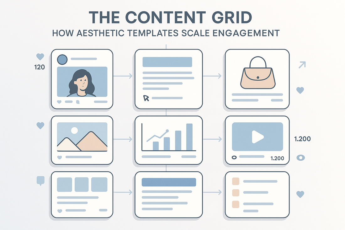
Visual systems have quietly become one of the most effective drivers of digital engagement. Amid rapid content cycles, multi-channel campaigns, and increasingly design-aware audiences, aesthetic consistency is no longer just a matter of branding—it is performance infrastructure. At the core of this infrastructure is the content grid: a structured yet flexible visual system that enables scalable storytelling, audience retention, and measurable ROI.
This blog explores how aesthetic templates—organized within a strategic grid—help brands outperform peers by reducing content fatigue, reinforcing visual memory, and unlocking multi-platform growth. For founders, marketers, and creative-led businesses, the content grid is a tactical advantage in a saturated media environment.
Understanding the Content Grid Framework
The content grid refers to a visual and structural layout used to organize brand content across platforms. It includes consistent styles for typography, imagery, animation behavior, post types, and even color logic. The goal is not just to make content “look nice,” but to engineer predictability, recognition, and speed across creation and consumption.
Modern content grids are no longer static. They operate like modular systems—allowing marketers to mix and match branded templates for carousels, reels, product drops, case studies, or founder videos, all while maintaining brand integrity.
A well-built content grid often mirrors UI/UX systems used in web design, where consistent spacing, alignment, and logic improve usability. The same applies here. Consistency in content layout reduces audience cognitive load and increases the likelihood of engagement.
Why Aesthetic Templates Increase Engagement Rates
According to HubSpot's State of Marketing Report, marketers who use branded templates in their content creation processes save an average of 28% in production time and report 33% higher engagement when using consistent visual systems. These numbers reflect a simple truth: visuals that look intentional earn trust.
Engagement is not random. It is a byproduct of visual memory, clarity of message, and emotional resonance. Templates streamline that equation by removing aesthetic friction and letting the message shine.
One practical example comes from an e-commerce fashion brand that implemented a five-template content grid for its Instagram. Each template had a defined role—announcement, product feature, quote, education, and UGC—and followed a clear style rule. Within three months, the brand’s reach-to-engagement ratio increased by 41 percent, and carousel saves doubled.
Designing for Visual Consistency Across Channels
In an environment where audiences consume on multiple platforms—TikTok, Instagram, LinkedIn, YouTube Shorts—a strong grid helps maintain brand presence without visual confusion. The aesthetic shifts slightly per channel (e.g., aspect ratio, tone), but the underlying template system remains the same.
Ukiyo Productions supports this approach through its work in digital product launches and content systems, providing scalable branding toolkits for founders managing high-volume media output. These toolkits include design-safe zones, animation logic, and visual libraries to maintain consistency without exhausting the team.
Branded template systems also enhance automation workflows. When integrated with tools like Canva for Teams, Notion, or Figma, grids become drag-and-drop foundations that reduce bottlenecks. For advanced users, these templates can be automated further via Make.com workflows, triggering asset generation for new blog posts, product launches, or email sequences based on specific rules.
Grid Psychology: Predictability Builds Trust
Psychologically, humans are pattern-seeking. The predictability of a content grid signals clarity, professionalism, and reliability. When a brand cycles through five to seven defined templates, the audience unconsciously begins to associate that pattern with the brand itself. This improves brand recall and encourages repeated interaction.
Much like consistent UX boosts retention on web platforms, consistent content visuals reduce the friction of re-engagement. It becomes easier for users to know what to expect, where to find certain kinds of value, and what posts are worth saving or sharing.
In particular, carousel-style formats—used widely on Instagram and LinkedIn—perform better when layout rhythm is predictable. According to Influencer Marketing Hub, carousels with uniform type hierarchy and visual framing average 2.2 times more saves than non-structured content of the same topic.
How Grids Improve Creative Output Without Sacrificing Identity
Creative burnout is a real risk in brands that rely heavily on content marketing. Founders, social managers, and designers often feel pressure to constantly innovate, which leads to inconsistent aesthetics or unsustainable production timelines. The grid solves this by offering a creative boundary.
Instead of inventing from scratch, teams work within predefined formats, freeing up bandwidth for storytelling, copy refinement, or creative concepting. This protects creative energy while sustaining brand cohesion.
Crucially, a grid is not a limitation—it is a multiplier. Some of the most visually creative brands, from lifestyle studios to SaaS companies, operate on rigid internal grids. Their originality lives within the structure.
Template Categories That Drive Engagement
A high-performing content grid typically includes templates that cover a range of engagement goals:
-
Education: Tips, stats, thought leadership
-
Conversion: Product callouts, testimonials, UGC highlights
-
Connection: Founder notes, community photos, values-based messaging
-
Reach: Short-form reels, trend-based visuals, social proof
Each type has a distinct layout and purpose. This distribution ensures the brand touches every part of the funnel—awareness, consideration, and conversion—without content looking chaotic.
The Marketing Branding Mastery toolkit by Ukiyo includes a templated system structured around this model, making it easier for growth teams to plan across formats while maintaining aesthetic strength.
Examples From Culture and Commerce
Brands like A24, Glossier, and Kin Euphorics have famously used aesthetic content grids to build cultural capital. Their visuals feel cohesive across every touchpoint—from IG Stories to landing pages—not because of rigid sameness but because of fluid structure.
A24, for example, uses cinematic stills and bold type overlays in fixed formats. Kin Euphorics sticks to pastel gradients, serif-heavy fonts, and soft grid spacing across its product cards and content drops. These design systems enable fast creative turnaround while reinforcing brand values.
Even in B2B, brands like Notion and Webflow leverage design systems to create scroll-stopping carousels and landing pages that are instantly recognizable. The polish of the grid often outpaces the technical function in terms of first impression.
When to Break the Grid (And When Not To)
There are moments when breaking the grid can serve a purpose—campaign launches, product announcements, major rebrands. These are moments of intentional disruption, meant to create contrast and reset audience expectations.
However, breaking the grid should be a strategy, not a default. Brands that disregard consistency too frequently lose recognition equity. If every post looks different, nothing stands out.
Consistency does not mean every template looks identical. It means there is logic behind design variations, a system that evolves without becoming untraceable.
Building Your Own Grid: Where to Start
Founders or creative leads looking to implement a content grid should begin by:
-
Identifying 3–5 core content types
-
Auditing visual assets already performing well
-
Defining spacing, alignment, type hierarchy, and color logic
-
Designing templates based on these rules
-
Testing engagement across 2–3 platforms
Even small businesses can build strong grids using free or low-cost tools like Canva Pro, Figma Starter, or Google Slides. What matters most is intentionality and pattern visibility.
Once the grid proves effective, it can be expanded into video assets, story templates, and ad sets—forming a visual language that supports long-term growth.
For those without an internal design team, Ukiyo’s services offer creative automation packages that include aesthetic systems tailored to the brand’s identity and goals.


0 comments