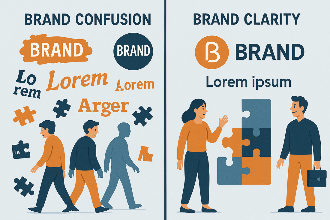
Visual confusion is silent friction. It disrupts user trust, reduces brand recall, and causes drop-offs across every channel—from websites to social feeds to email campaigns. In the aesthetic economy, where perception and clarity directly impact buying decisions, even subtle inconsistencies in design can erode customer retention.
This post breaks down how visual inconsistency sabotages user experience and explores how intentional branding systems can reverse that churn. For founders, marketers, and design-led businesses navigating competitive digital spaces, getting this right is no longer optional.
What Visual Confusion Actually Looks Like
Visual confusion can manifest in several ways: jarring color changes between pages, logo misuse, misaligned UI components, or erratic social content that lacks any stylistic thread. It also includes micro-mismatches—like a product page font that doesn’t match the email header or inconsistent photography styles across ads and landing pages.
These inconsistencies might seem minor. But they compound in a user’s subconscious. Research from HubSpot shows that 38 percent of visitors will stop engaging with a website if the layout is unattractive or hard to follow. More importantly, once trust is lost visually, it becomes significantly harder to recover through words or offers.
Why Retention Suffers When Aesthetics Fracture
Customer retention hinges on a brand’s ability to make users feel anchored. When visuals shift tone or style without reason, the experience feels fragmented and unreliable. This creates cognitive dissonance—a psychological discomfort that drives users to seek familiarity elsewhere.
In subscription-based or community-driven businesses, visual coherence becomes a stabilizing force. It allows returning users to navigate with ease, recognize patterns, and feel connected to a larger narrative. When that coherence breaks, retention becomes a costly challenge.
A well-known wellness brand reported a 15 percent decline in repeat customer engagement after redesigning its packaging and email visuals without updating its website. The sudden shift in style created confusion, with users questioning whether the brand had been acquired or changed direction.
The Cost of Inconsistency Across Channels
Disjointed visuals across channels lead to a fractured user journey. For instance, an Instagram ad with bold, modern visuals might link to a product page that looks dated or generic. The user clicks through but doesn’t convert—not because of price, but because the brand no longer feels credible.
This channel confusion is particularly harmful in automated funnels where users move from email to web to social and back. Every mismatch creates a break in trust, reducing the effectiveness of retargeting and increasing acquisition costs over time.
Ukiyo Productions offers services specifically designed to prevent these breakdowns by integrating branding systems, UX design, and content automation, ensuring every channel reflects the same visual language and energy.
How UX and Design Systems Build Visual Trust
Design systems are the antidote to brand confusion. They offer scalable guidelines that define color use, spacing, typography, image treatments, iconography, and interactive behaviors. These systems make consistency possible across large teams, rapid campaigns, and multi-platform rollouts.
One D2C cookware brand used a design system to unify its visual output across social media, packaging, Shopify, and email marketing. After implementation, bounce rates dropped by 23 percent and average session duration increased significantly, suggesting deeper trust and brand alignment.
A good design system is more than a Figma file. It includes rules around emotional tone, layout flow, and responsive logic. These elements together create a visual environment where users feel held and guided.
Why Story-Led Visuals Perform Better
Visuals are not just decoration—they are narrative vehicles. Consistent imagery and layout flow help carry a user through a brand journey without dissonance. A product launch page with aligned visuals across pre-launch ads, landing content, and post-purchase emails outperforms fragmented campaigns because it delivers a sense of continuity.
This principle is especially important when launching digital products or campaigns. With tools like Ukiyo’s Product Launch Planner, founders can organize their visual strategy alongside their funnel strategy, ensuring each touchpoint tells the same visual story.
Platforms such as Instagram and TikTok reward visual storytelling that feels cohesive. Brands that succeed tend to maintain consistency in filters, color themes, and graphic overlays—even as the content itself evolves. Users associate these visual signals with identity, which deepens engagement and prolongs attention.
When Rebrands Confuse Instead of Clarify
Rebranding is often necessary, especially during product pivots or audience evolution. But when not handled with aesthetic integrity, it can backfire. This happens when the new identity fails to resolve core confusion or introduces a design direction misaligned with user expectations.
The key is evolution, not abandonment. Successful rebrands retain visual elements that have become familiar while introducing upgraded assets with clearer logic. For instance, keeping a signature accent color while updating font systems and layout grids maintains continuity while signaling growth.
One creative agency featured in Adweek shared how a partial brand refresh—focused only on visual rhythm and layout spacing—resulted in higher user satisfaction than a full rebrand would have. Users appreciated the evolution because it felt like a natural deepening, not a rupture.
Automation Tools Can Reinforce Consistency
Automation is a powerful ally in maintaining brand clarity across scale. With tools like Make or Zapier, brands can automatically apply design systems across recurring workflows—such as auto-formatting Instagram stories, resizing graphics for paid ads, or pre-scheduling branded email headers.
This ensures that no matter how many platforms or content pieces are running in parallel, the core aesthetic remains intact. Automated design logic also reduces room for human error, which is one of the most common causes of visual inconsistency.
At Ukiyo, automation tools are integrated directly into campaign workflows, combining AI-assisted visuals with brand presets to ensure fast yet aligned content execution.
Visual Clarity Reduces Support Requests
Surprisingly, poor visuals often create backend issues. Confusing layout structures or non-intuitive design elements result in higher customer support inquiries. Simple aesthetic fixes—such as button hierarchy, typography scale, or product preview placement—often reduce customer confusion and increase clarity without changing any product functionality.
According to data published by McKinsey, brands that invest in design-driven clarity not only see revenue lifts but also reduce operational strain, including support tickets and user drop-offs.
Reducing visual confusion is not just good for retention; it is also cost-efficient and performance-aligned.
What Retention-Ready Brands Do Differently
High-retention brands share common visual behaviors. They anchor users in familiar layouts, they offer rhythm in content flow, and they resolve tension quickly with intuitive design. Their branding feels alive but stable, distinct but not alienating.
These brands are not just better looking—they are easier to trust. Their visual presence reflects operational stability, creative integrity, and attention to user emotion.
Creative founders and marketers looking to deepen brand retention can access visual alignment tools, launch systems, and design planning frameworks through the Ukiyo resource collection, built specifically for high-aesthetic, automation-ready campaigns.


0 comments